We’re excited to announce that Boingfire Systems is unveiling a refreshed brand identity, starting with our new logo.
Evolution of Our Brand
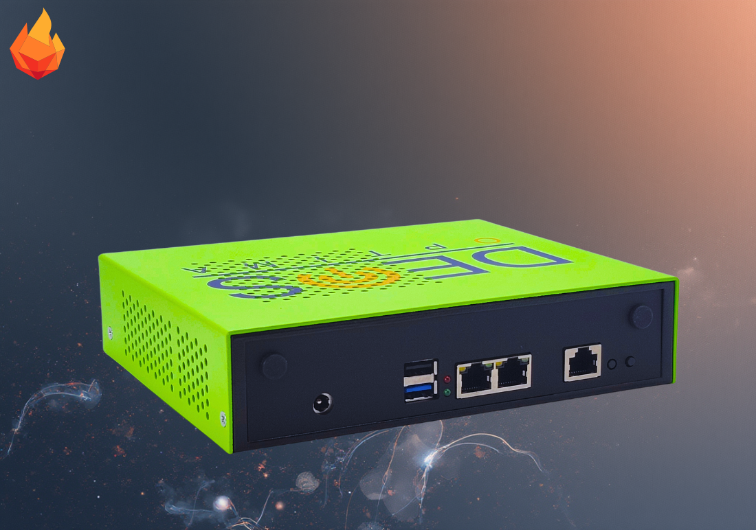
As we continue to grow and expand our capabilities, we felt it was time for our visual identity to reflect the dynamic and innovative spirit that drives our team. Our previous logo, with its distinctive dot pattern, served us well in our early journey. Today, we’re proud to introduce a bold new design that better represents who we’ve become.
What’s Changed
Our new logo features a vibrant flame icon, a powerful symbol of energy, transformation, and forward momentum. The geometric flame design in warm oranges and reds captures the passion and intensity we bring to every project, while maintaining a clean, modern aesthetic.
The updated wordmark “Boingfire” now appears in a refined, contemporary typeface that speaks to our commitment to professionalism and precision. The sharp, geometric edges of the flame icon reflect the accuracy and precision that define our product designs, with every angle intentional and every line purposeful.
What Stays the Same
While our look has evolved, our core values remain unchanged. We’re still the same team dedicated to delivering exceptional results and innovative solutions for our clients. This rebrand ensures our external image matches the excellence we strive for internally.
Looking Forward
This logo change marks an exciting new chapter for Boingfire Systems. We’re grateful for your continued support as we evolve and grow.
Stay tuned for more updates as we roll out our refreshed brand across all platforms.